When Rivet engages with a client, we talk about our process and how it all works to achieve results. Our mantra, “capture, craft, connect, calibrate” may not make a lot of sense to outsiders, but for our team, it informs our approach to solving a problem.
Take the Southwest Florida Wine & Food Fest as an example. Rivet was tasked with developing a brand for this keystone annual fundraising event to benefit pediatric healthcare services in the region. We approached the first task of building an unforgettable identity by leveraging a variety of creative exercises meant to fully explore the challenge and focus on solutions.
When people see a logo in all its polish, it’s easy to dismiss the process. The process, however, is incredibly arduous to achieve the height of simplicity. There is a great deal of thought that goes into developing a brand identity that isn’t visible. It’s like a duck on a placid lake. On the surface everything is calm. Underneath, however, it’s synchronized chaos. That serene surface belies the effort underneath. That’s how it is when you’re working on a logo.
A logo, while a simple mark, does a lot of heavy lifting for a brand. It fully encapsulates the product or cause or company positively, creatively, and uniquely.
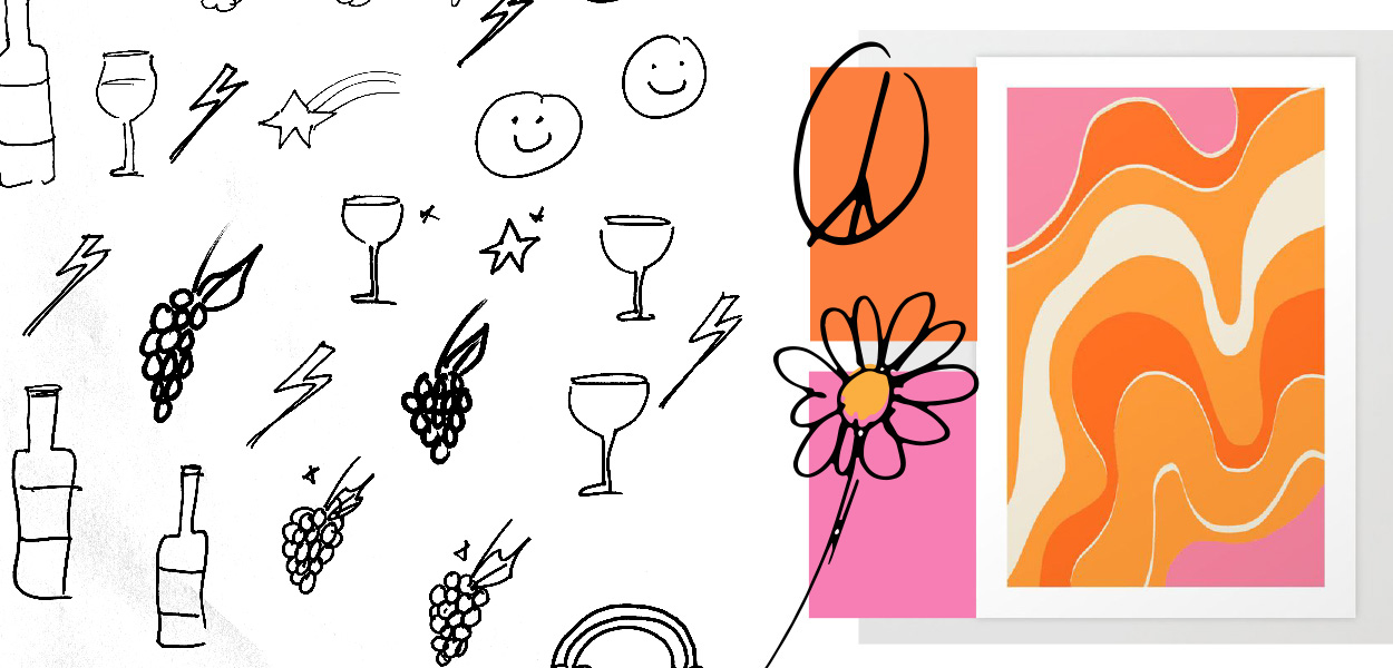
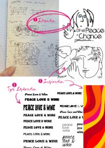
For this project we leveraged several exercises, including mind maps, pencil sketches, type choices and treatments, mood boards with color swatches, and inspirational images just to get to a place where we could begin to see the potential logo peeking out from under the surface. Every interaction with the client informs and directs design decisions because ultimately, the client has the solution locked in their mind. A designer’s job is to find a way to release it.
That’s how it was for this assignment. Lots of work under the surface to ensure the logo worked simply.
The inspiration for the work was eclectic and included imagery from the 70s, “Peace, Love & Wine,” and the idea of #GivingIsGroovy – without being too “flower powered” or psychedelic. The selected design was ultimately inspired by Picasso’s “Dove of Peace” sketch and features hand-drawn elements to keep the elegance and sophistication the organization aspired to achieve.
![]() The goal was to be playful and informed by childlike wonder since it was a charitable organization for children. We like what we achieved. More importantly, the client loved it.
The goal was to be playful and informed by childlike wonder since it was a charitable organization for children. We like what we achieved. More importantly, the client loved it.